Inspired by our recent (and on-going) Direct Mail Toolbox series—today we’re going to try something new. We’re going to open up our mailboxes to the world and provide an in-depth analysis of whatever’s inside. You’ll see real-world examples of the individual elements of a direct mail marketing piece in-play. Then we’ll dissect each component and discuss what we think works, and where we see room for improvement. Our hope is that this inspires you to take a closer look at your own direct mail marketing and think of new ideas or enhancements to try. Welcome to Inside the Box.
This week on Inside the Box we’ll be reviewing one of Heights Finance Corporation’s latest mailings. Heights Finance Corporation is a lender who provides small loans to residents in the Midwest. Unlike larger lenders, Heights Finance’s loans are non-guaranteed so getting approval is based on a thorough credit check, and limited to $1,200.
The Outer Envelope
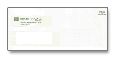
- Standard #10 double-window envelope
- Name/Address shown through the window
- Branded with Heights Finance logo
- No other OE messaging
The envelope is branded so it’s clear who’s sent the package, but with the absence of any other messaging, the recipient may not be sure why. When your communications are branded, it could help to establish credibility for your brand, which is a good thing when you’re talking loans and finance. That said, being transparent and telling recipients right upfront why you’re reaching out to them even further reinforces the idea that you have something worth your audience’s additional reading and consideration.
This may have been a missed opportunity to test variable outer envelope messaging that speaks specifically to Heights Finance Corporation’s audience. We’ve seen outer envelope messages impact open rates, and subsequently—response rates—by as much as 130%. Height’s Finance serves the Midwest exclusively, so addressing recipients in their respective areas could make the messaging stronger and more relevant. For example: “Heights Finance has loaned thousands of dollars to Wisconsin residents just like you.”
Inside the Package
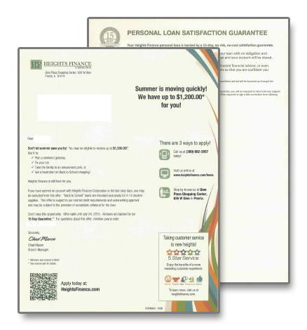
Once inside, you’re presented with a single, two-page #10 letter, which immediately draws your attention to the headline in the upper right-hand corner:

“Summer is moving quickly! We have up to $1,200.00* for you!”
This is what made the piece really stand out in our eyes. Seasonality is often overlooked when businesses handle their direct marketing, and that’s a missed opportunity. Why send the same message you send in the winter as you do in the summer? Sure you may be offering the same product or service, but people change, their spending habits change and their needs change depending on many factors including seasonality. You can address this by making your message timely.
As we move through the letter, the seasonally relevant summer messaging theme continues by highlighting summer-oriented activities that you could potentially fund through a loan from Heights Finance. They highlight vacations, amusement parks, car repairs and back-to-school shopping as potential ways to use the funds. Now the package is not only timely, it’s relatable—a perfect combination.
The letter goes on to address specific criteria that you must meet, or criteria that may disqualify you from receiving a loan from Heights Finance Corporation. While this type of content is typically reserved for disclaimers, there’s something to say about being transparent here.
The letter closes by adding a sense of urgency to the offer—it’s said to expire at a specific date. It also provides you with a promotional code, most likely for tracking purposes. This is standard practice for many of our clients, but the positioning of the promotional code is a bit odd. It states “For questions about this offer, mention promo code: XYZ.” In order to build on the sense of urgency declared in the same paragraph, we might suggest something along the lines of “Call today with your promo code XYZ to claim your offer.”
In the sidebar, Height provides you with three ways to respond: The Height’s Finance website, a phone number, and the nearest location to the recipient. We have no complaints here; they’ve provided something for everyone. A web CTA is also listed at the bottom of the letter in the form of a QR code, which delightfully drives to a mobile-friendly landing page. A “5 Star Service” rating implies that Heights provides exceptional customer service, yet does not provide specific qualifiers. We might suggest adding some details here.
The opposite side of the letter details a 15-day guarantee. The guarantee helps establish Heights as a credible financial institution, offering customers the opportunity to simply return the loaned monies and cancel the loan agreement within 15 days. What's absent is any additional reasons to believe, differentiators from other loan providers, frequently asked questions, or testimonials.
Closing Thoughts
Overall we commend Heights’ use of best practices throughout the package—particularly seasonality to enhance relevancy. That said, we’d like to see a little more information on the customer experience, and more reasons to believe for those actively seeking this type of loan product to differentiate Heights from the competition.
Wilen’s Stamp of Approval: 7/10
Pros:
- Timely messaging
- Creates urgency
- Clean design
Cons:
- Weak reasons to believe
- No testimonials
- Missed opportunity for personalization


